
Today I will try to record an entire creation process, something I have never been able to do in my life, and I don't know if I will be able to (we will only know in the end hahahaha) so let's go, let's start this mess!

HOW TO CREATE A RETRO GAMING MAGAZINE!
REFERENCES
Remember this one? Well, I talked about it in Mariya's post, and as promised, it's back! I loved this magazine, I found it in a bookstore a while ago when I went to the city to work for my partner at the events where she sells her stuff, by the way, go check out her work


Photo of the magazine / photo of the partner's sales table
But back to the magazine, here's everything I found about it and everything I could extract from the careful dissection that only a person who knows NOTHING about Japanese can do! (by the way, guys, I'm trying to learn Japanese, if anyone knows it and wants to help, just call u_u)
First of all, there's so much stuff written on this cover that it's hard to even know what it's called, so with a quick Google Lens search I found out it was a CoroCoro Comic, a monthly magazine (not a magazine, a BRICK, almost 800 pages!) for children, where various news about games, products and manga were published, such as Pokemon, Kirby, Doraemon and so on. I'll be honest, it caught my attention a lot because of the different types of pages, the prints and the papers used in it... after all, I studied and work a lot with design so this kind of thing is a treat for the eyes


I'll leave these images here of the most interesting things I found in this magazine, but the truth is that there's a LOT in it....and a lot of stuff that's really wrong too....but hey, it's a magazine from a culture that's not mine from over 30 years ago, so let's focus on the cool stuff! Like for example:


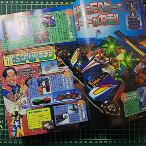


PROPAGANDAS: man, I've never wanted to buy FISHING GEAR so much, seriously, these guys make fishing look way cooler than it is, and well, as someone who worked in marketing I can safely say, EVERYTHING HERE IS PROPAGANDA, but unlike a lot of today's stuff, it's pretty cool, you wouldn't say no to a chubby Pikachu would you?


MANGAS: : as far as I understand, many of the manga we read today with their own magazines started in these types of mega compilations here, and I must say it sounds pretty cool, there are several stories here that look like great fillers, oh and it's worth remembering that the products have their own manga, like exciting stories of mini-kit cars, fishing or even the incredible Doraemon's FRIGATE

FREEBIES: who doesn't like freebies? I do, even if you paid a lot for something, pretending there's a freebie in it that came for free is great! And there are several here, like Pokemon stamps, scratch-offs and amazing decals for your mini-kit car


GAMES: this is not the focus of this magazine itself, but several others I read were totally focused on games, some even having the codes for you to put the game on your amazing PC-8800 and go play with your friends, what I like about this one is that it's from 1997, so 3D video games like the N64 and PS1 were the new thing, not only that, THEY WERE THE FUTURE, check out these amazing graphics man!
AND MUCH MORE THAT I STILL DON'T UNDERSTAND BECAUSE I DON'T SPEAK JAPANESE!
But seriously, there's some really cool content here, and I've been looking for several of these old magazines, especially the Japanese ones, because there were a lot of really cool games that only came out there, so I'm doing a lot of research on them, and here's a tip, the amazing Internet Archive has a LOT of these old magazines there, I highly recommend that if you like this kind of thing take a look, it's a whole giant world available
"Wow, cool, old magazine that you don't understand anything about, but what about it?" you must be wondering, well, I haven't done any design for a while so I decided to do a magazine project based mainly on that one, and on the Jogo Veio magazine, which is currently released here in Brazil and I really like it, and why not take advantage of it and share the process? So let's go:


Go subscribe to Jogo Veio it's really good
STEP 1 – RESEARCH
Well, this is that first part up there in the real, look for references, analyze them, catalog everything, see what's good and what's bad, what I like what I don't and so on
STEP 2 - STRUCTURING
It's here that the fun stops and the work starts (just kidding, I have fun with the rest too) I'm a person who loses interest in things quickly, so my first goal is to put everything on paper in a way that I can imagine how long I'm going to be on it, and in a more concrete way to think about what steps I have to take, and what I want to have in this little project. So based on the fact that I want to do something "short" but still have enough to turn it into a magazine, I ended up making this to-do list:
A5 magazine
Define subjects and write them
Cover p.01
Editorial cover p.02
Advertisement p.03
GB game p.04 - 05
Game postcard page p.06 - 07 (smaller sheet)
Comic selling product p.08
Page to buy the product by mail p.09
Back cover p.10 - 11
Define Style
Pixel art
Japanese magazine
Create art
Cover art
Game heroine
Layout
Here I already divided into how many pages it will have in the end and what will be on each one of them, and that's what I call a lot of content.....and that's just initially, for sure new things will come up along the way, so while I'm thinking about this structure I'm already taking advantage of reviewing my references and writing down what I imagine will be in each part, and with that I can move on to the next step (by the way, before that, I decided to make a prototype, and oh oh, the number of pages doesn't match the number of sheets lol, I had to readjust some things in the planning because of that)
STEP 3 - HANDS-ON
At this point here I personally have to be careful not to get lost, so I define a day to do each thing, and then little by little have the whole project, as the cover should be a summary of all the content I'm going to leave it for the end, and focus on the internal sheets

But before I started all this I remembered an important part, the PROTOTYPE, and that should have been right after imagining the content, because it was here making this little prototype that I already understood that the pages that I numbered here above would not work so well...and that I probably should add two more to have a special sheet just right for the postcard, but I don't have much time so let's go with the good old GAMBIARRA.
Gambiarra. from Brazilian Portuguese. Of humble origins
Emerging from the heart of Brazilian culture, "gambiarra" embodies the innate art of improvisation, transforming limited resources into ingenious solutions. Rooted in a spirit of resourcefulness and practicality, gambiarra is a testament to the human ability to overcome challenges with creativity and a touch of artistry
After making the prototype and confirming everything, I started taking and editing some photos that I wanted from some of my tapes, and I looked for some mockups that might be interesting to use around here (and here's a tip, when taking a picture of an object, look for a neutral background to make your life easier) so after these steps, I opened Illustrator and put the correct bleed for my printer, decided on a content area based on my references (believe it or not, but even with the absurd amount of content that the CoroCoro has, incredibly they respect the safety margin of one centimeter) and in the end I came out with a skeleton more or less like this:

-Ah but shouldn't you have used InDesign instead of Illustrator, wouldn't it be much easier? YES, it would, anonymous reader, but it's a magazine with few pages and I wanted to have a little more freedom of style

Advertising: right off the bat, as usual, PAM, something to buy, I decided to make an advertisement for the tapes I make here at home, so I took some pictures of them, I took a picture of our radio and I got other devices from the internet to add to the example images, I have to say that I got a little dizzy making this page, as it was the first one I had to go back to the 2000s XD, oh and one valid thing to say, I'm using a personal color palette for the project, which I use for everything lately, and I did a light color treatment on the photos to give them a lighter and more contrasting look for those 90s photos

Game: This double page was what prompted me to go back to developing my short GBC game. I'm terrible at programming, so I got stuck, but I needed to make new screens to use as examples in the magazine and illustrate it better. I really liked how these mockups turned out and it gave me even more motivation to produce the game

Comic: And this would be a simple comic? Of course not, it's an advertisement disguised as a comic! Jokes aside, a good part of the comics in the magazine I'm using as an example are literally advertisements, but they're great advertisements. They have some pretty cool stories and make extremely mundane things seem like the best things in the world. Here's a tip: live your life like it's a comic that advertises a mini-kit car


Postcard: This is the part I liked the most, because I really like cards, and I like to draw pixel postage stamps. Since I had already made a stamp of the city where Bea's story (the little girl in the double-page game) takes place, I thought, why not make this a gift in the magazine as a postcard? And this is where the cutting got a little confusing. I would have needed two more pages of content to do this properly and make it work well when stapling, but nothing beats a good gambiarra so I didn't have to double my work.

Letters: I have to admit that it was very difficult to translate this part of the magazine (again, I can't read Japanese, but I'm trying to learn) and the readers here seem quite chaotic. There are people talking about the comics, the advertisements, the prices of things, work and even vacations! Really an open space, so I obviously forced my friends to send letters to my magazine

Back cover: In the CoroCoro that I'm using as a reference, there is already an advertisement on the back cover, so I decided to bring something from my region and put an editorial explaining the reason for the little magazine

Back: Advertisement again? Yes! But this time I used a drawing of mine that I really liked, and I wanted it to be something that could be cut out later and turned into a mini poster as well hehehe, and don't forget, every magazine has a barcode (you have to sell it in the end, right? )

Cover: AND FINALLY the cover. I tried to take an image from each corner of the magazine. I even had to go back to the file I made the cover of Bea's game tape to make the background bigger and put it on the cover of the magazine. And this is where the hardest part of this whole project came in.....CHOOSING THE NAME. I'm horrible at choosing names, but I had two things I wanted: a name that would repeat itself, to pay homage to CoroCoro, an easy name, and a name that made sense with the things here. I went through things like PequiPequi (which has nothing to do with the theme but is a fruit with a funny name) to ReBobina (in Portuguese this is a pun on rewinding a tape, which turned out to be a cool but complicated logo) and others that I don't even remember because I was having a name crisis at the time. And after so much typing, I stopped, paid attention to my surroundings, and finally I could hear what I did the most in this whole project....typing, so I went with TecTec Magazine (which I tried to put in Japanese to give it a charm, and it may be spelled wrong, hello anonymous Japanese reader, just give me a heads up about that)


The logo tests and the final version of the file
And my god, that was it. Printing was a pain in the ass. Printing a little magazine on a regular printer gives you a lot of headaches to align the paper and put it in the right direction, but after a few mistakes it finally came out and you can check out how it turned out here (by the way, this idea of putting a postcard in the middle with paper of another weight screwed me up a lot in this part of the process, but it turned out great!)


Man, what a job, I think I spent a week on this (not counting the other things I have to do in life u_u) if you got here after this giant text, I really appreciate it, I hope you had fun with this kind of chaotic process, and that I helped in something, any questions, any corrections or if you want to send a hello to the comments area down there is open
Keep on reading, look for cool stuff in old bookshops and remember to hydrate yourself ʕ •ᴥ•ʔ/
コメント